
Ronald Reagan speaking at the Brandenburg Gate on June 12, 1987: Mr. Gorbachev, tear down this wall!
In your author’s humble opinion, this chart from the Thomas B. Fordham Institute is the most revealing K-12 graphic of the last decade.
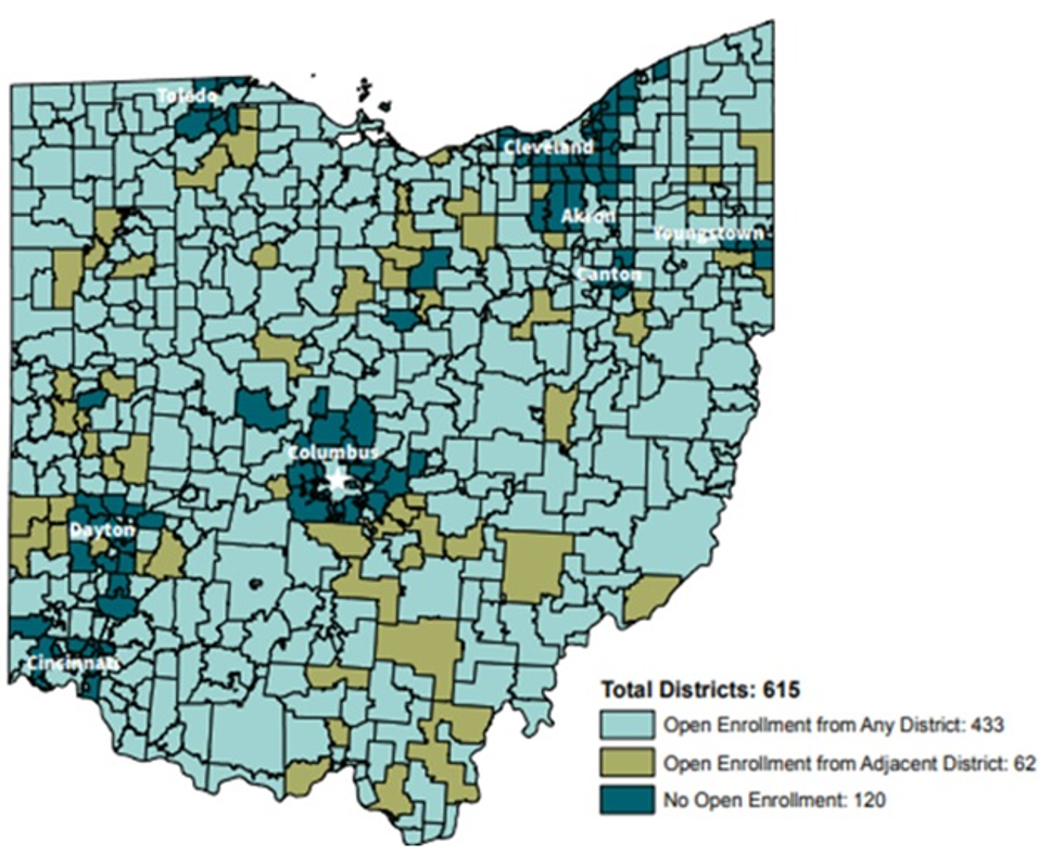
Ohio’s urban areas find themselves surrounded by districts that choose not to participate in open enrollment, featured in dark green. The children of Columbus, for instance, represented by the white star, appear to be surrounded by districts that do not offer open enrollment.
Later this week, this blog will offer a podcast interview with Chad Aldis, vice president for Ohio Policy and Advocacy at Fordham, whose research produced this map. Before criticizing the Ohio suburbs that deny open enrollment, let’s just put it on the table that a map of your state, if one existed, might look eerily similar to this one.
Unless, that is, you live in Arizona.
In Arizona, nearly all districts participate in open enrollment. Open enrollment students outnumber charter students nearly two to one in the Phoenix area despite its distinction as the nation’s largest charter sector.
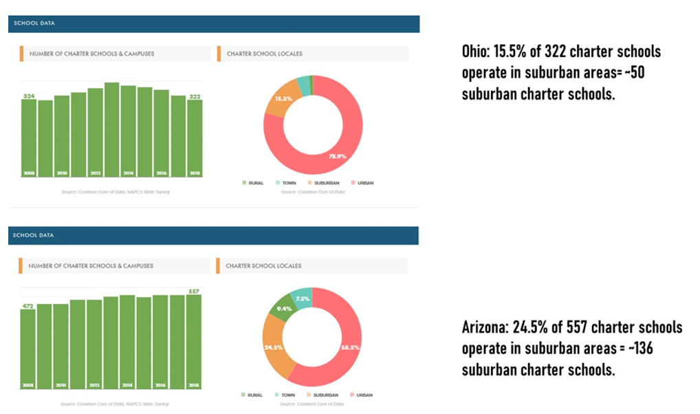
Arizona has the largest state charter sector in the country, with nearly 20% of students attending charter schools. Ohio not only has fewer charter schools than Arizona; the schools are more geographically concentrated in urban areas. Ohio has a larger student population – 1.7 million students compared to 1.2 million in Arizona – but has far fewer charter schools overall and especially fewer suburban charter schools.
Data from the National Alliance for Public Charter Schools shows approximately 50 suburban charters in Ohio compared to 136 in Arizona.
 The Brookings Institution measured the availability by the percentage of students with access to one or more charter schools in their ZIP code. Arizona led the nation with 84% of students having one or more charter schools in their ZIP code, whereas Ohio stood at 31.9%.
Your author is going to go way out on a limb at this point.
While it could be that the people running suburban districts in Arizona are unusually interested in stamping out economic and racial segregation because of the dry climate or … something … the level of non-district options held by suburban families has a lot to do with it. Scottsdale Unified, for instance, may accept 4,000 open enrollment transfers because 9,000 students who live within the boundaries of the district go to school elsewhere.
How is this working out for the kids?
Stanford University’s Opportunity Project linked state academic exams across all 50 states to allow comparisons between schools, districts and their associated charters, and counties. The chart shows the comparison for academic gains for poor children in the largest counties in each state: Maricopa County (Phoenix area) in Arizona and Franklin County (Columbus area) in Ohio.
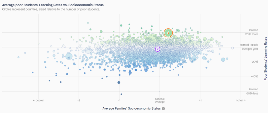
The rate of academic growth for poor students in Maricopa County is 19.3% above the national average for all students. The rate of academic growth for Franklin County students is 2.6% below the national average. Maricopa County outperforms Franklin County across all eight subgroups available in the Stanford data.
What we see in the Fordham map at the start of this post isn’t working, but don’t look for shame alone to open the gates of opportunity for Ohio’s urban students. Only broad choice programs can create the incentives needed to tear down these walls.