
The Stanford Educational Opportunity Project has developed a new data tool called the “Segregation Explorer.” Let’s start with the definition of what is being measured in this data, which stretches from 1991 to 2022:
Segregation estimates in the interactive map represent the two-group normalized exposure index, which measures the difference between two groups’ exposure to one of the groups. For example, the White-Hispanic normalized exposure index compares the proportions of White (or Hispanic, equivalently) students in the average White and Hispanic students’ schools. A White-Hispanic normalized exposure value of 0.5 indicates that the proportion of White students in the average White student’s school is 50 percentage points higher than in the average Hispanic student’s school (ignoring the presence of other groups aside from the racial dyad of interest). For more information on this measure, see our brief.
Okay so bottom line: darker is more segregated, lighter is less segregated. If we take the map back in time as far as it will go (1991) the White-Non-White student exposure index looks like this:
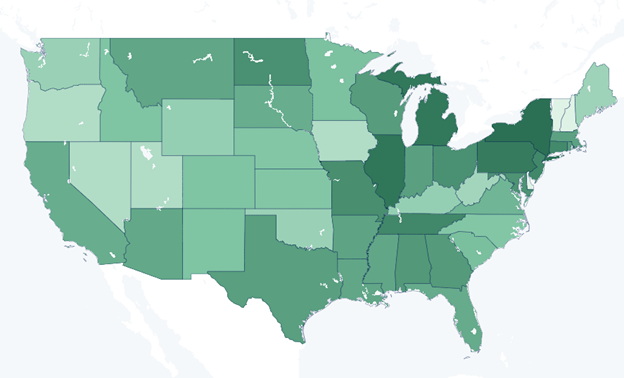
If you are squinting at your phone, New York was the school segregation capital of the United States with a white-non-white exposure index of .62. Fast forward to 2022 and the white-non-white exposure index map looks like:
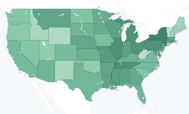
Thirty-one years later, New York remains the school segregation capital, but at least it went down from .62 to .51.
Choice opponents often claim that choice programs are increasing school segregation. A sadly typical example came in a guest column claiming that school choice had made Arizona school segregation worse than the 1950s and 1960s (!)
Well, school level data from the 1950s is a bit hard to come by, but let’s check the trend in the Stanford Educational Opportunity Index-White-Non-White exposure index trend:
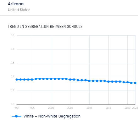
So again if you are squinting at your phone, in 1994 (the year Arizona’s charter and open enrollment laws passed- kicking off the K-12 choice era) the white-non-white index stood at .36 and in 2022 the same measure had dropped to .31- which just happens to be one half of the level of New York in 1991.
The Stanford Educational Opportunity Project also has updated figures for the academic growth of poor students. Let’s see how that worked out for Arizona (1) and New York (2):
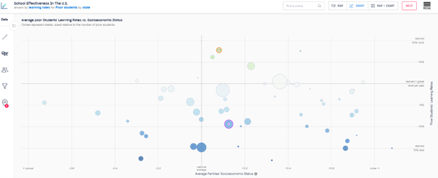
Somebody must be benefiting from the $38,000 per student spent in New York’s public school system, it’s a shame that the list does not include the students.